Case study
APEX STUDENT. Everything a student sees before they trust the app with their semester.
CMO · Brand System, Web, Visual Direction
June 2025 – Present
6 high school friends, now spread across the country
Brand system, website, mascot direction, social content, onboarding
Shipped — live on the App Store
APEX STUDENT is an AI scheduling app. I joined when the product existed and the brand did not: no site, no visual language, no personality. The scope was the whole surface — everything someone sees before deciding whether to hand over their calendar.
Students need structure and resent being told to have it. An app that markets like a productivity coach gets ignored. One that is too playful does not get trusted with a semester. The brand had to sit between those two, and the product had to feel like relief rather than another thing to keep up with.
So the AI got a personality rather than an interface. Scheduling is already stressful, and a system that only reports back at you makes it worse.
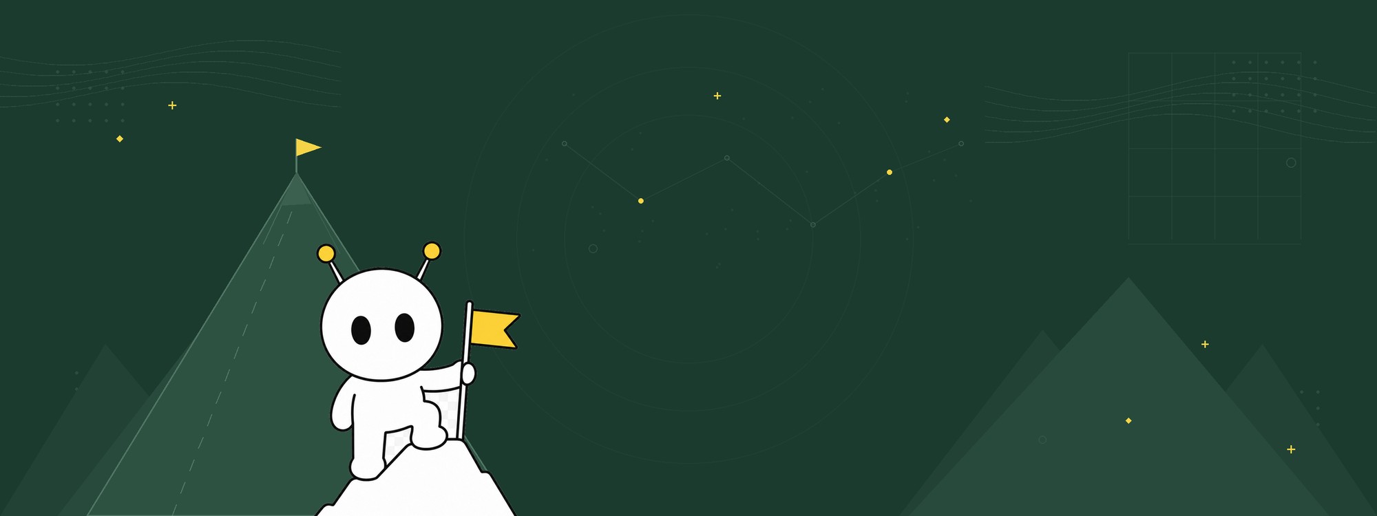
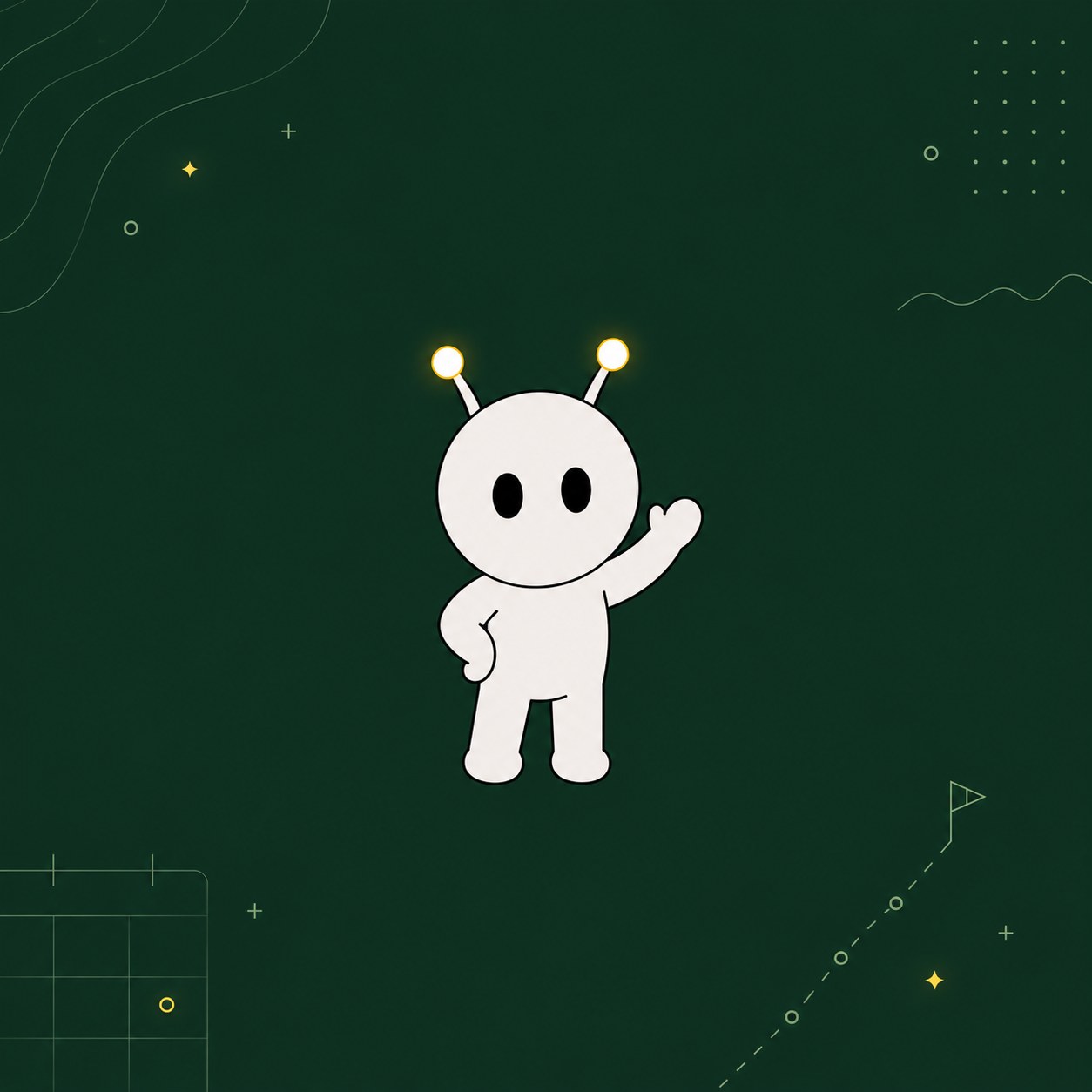
That is LOLA. She can say things a SaaS brand cannot — she will point out that you blocked four hours of grind time and opened TikTok — and she gives every surface the same narrator, from onboarding through to empty states. The rules about where she does not appear matter just as much. Nobody wants a mascot on a billing screen or an error.
Brand system
Logo, color, type and voice around a single idea: calm structure, warm voice. Then a face to carry it.
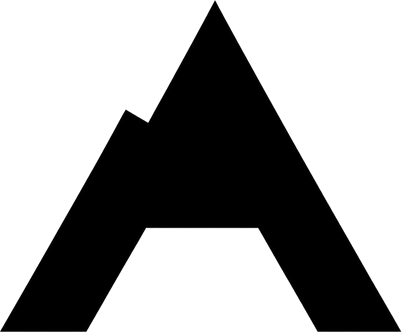
Symbol
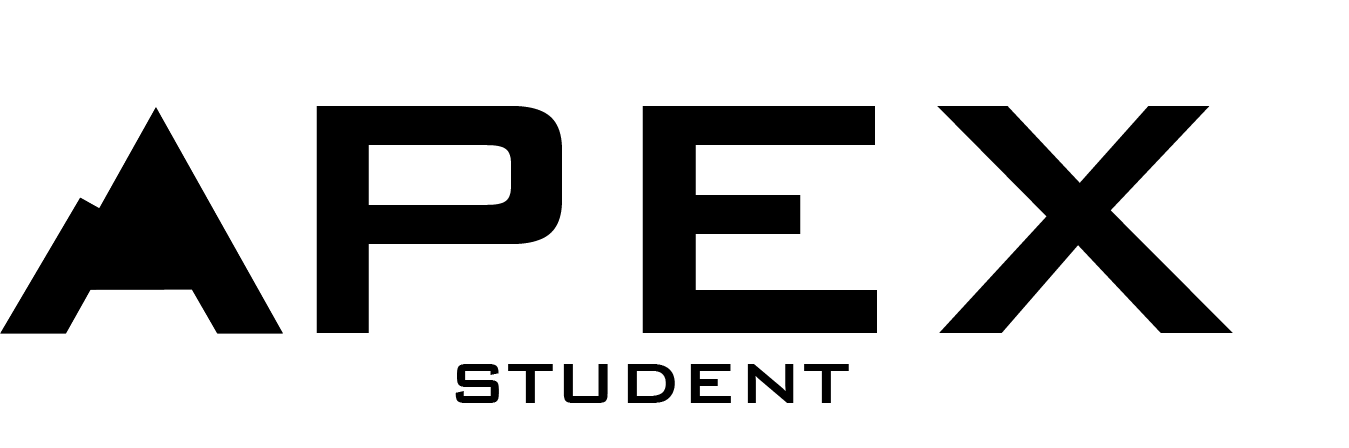
Logotype
LOLA
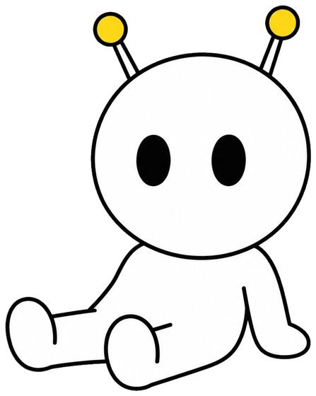
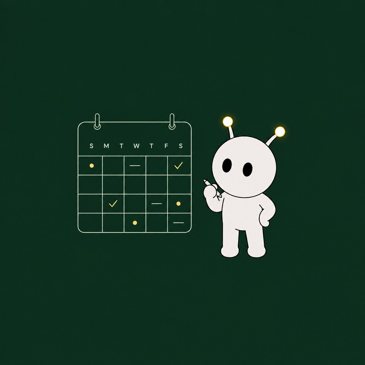
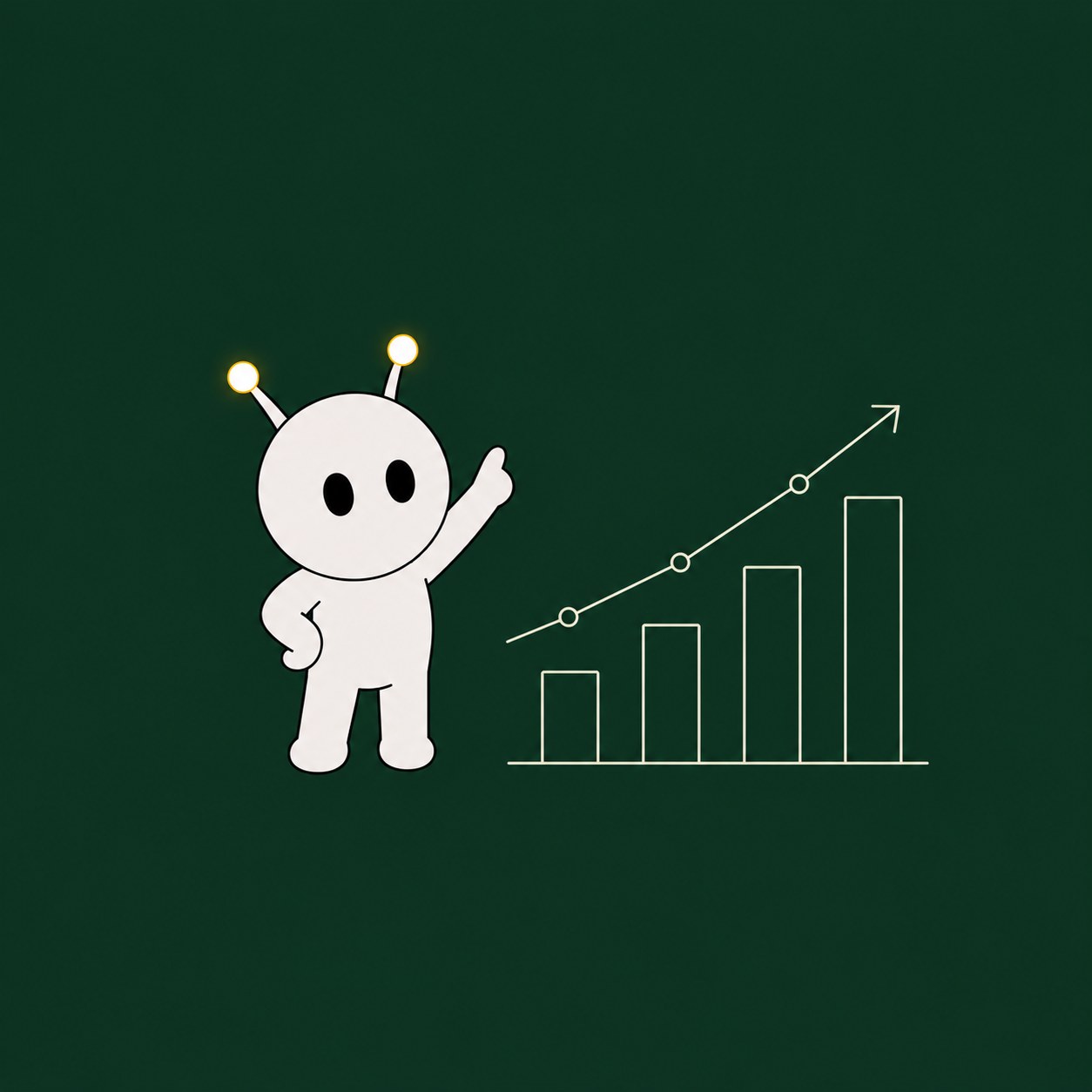
A personality spec, tone rules and a full expression set, so she can react anywhere in the product without drifting. Drawn as a character with a range, not a single mascot pose to paste into corners.

LOLA, full body
Expression set





Product UI
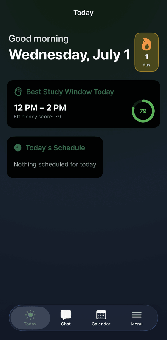
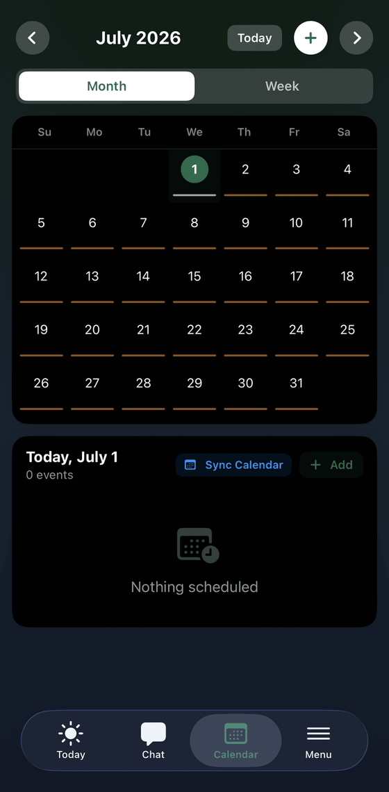
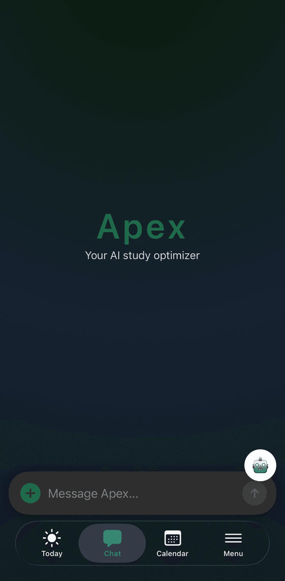
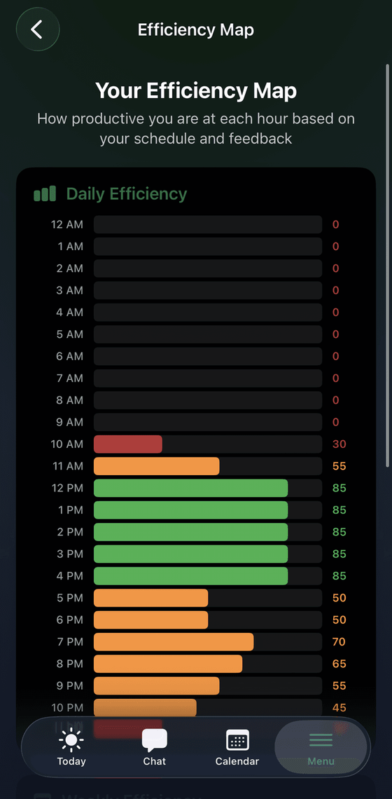
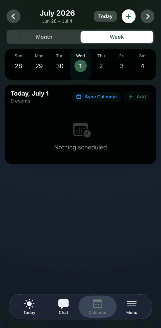
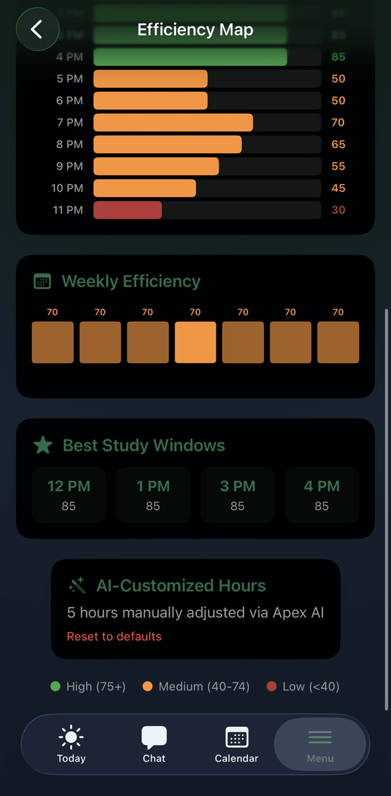
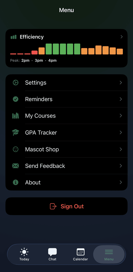
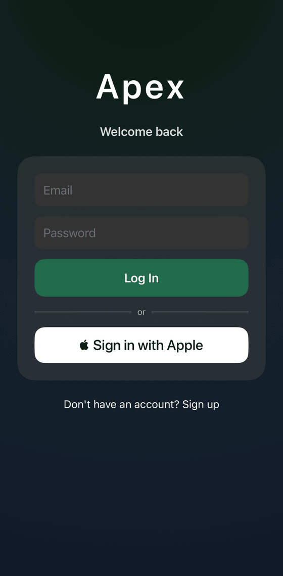
The app end to end: today view, calendar, the chat with LOLA, the efficiency map, the weekly plan, the menu, the login. The same voice runs from the marketing site straight into the product, so nothing changes register at the door.
Social content
A card format that turns each thing the app claims — clarity, balance, performance — into a slide LOLA delivers herself.

Onboarding
The first run designed as a moment with LOLA rather than a form. Whatever the brand promised outside the app has to survive the loading screen.
Loading Animation
We started as a generic calendar app — the kind nobody opens twice. We killed it. What replaced it is closer to encouragement than to scheduling: something that argues for your day rather than just ruling it into boxes.
APEX shipped. It is on the App Store, which is the point at which a brand stops being a set of files and has to hold up somewhere it cannot be art-directed — an icon two hundred pixels wide, a screenshot carousel, and a first run in front of someone who has never heard of us.
- Brand system
- Logo, mark, palette, type, key visual and the rules that hold them together — plus LOLA, drawn as a full character set rather than a single mascot pose.
- Surfaces
- The website, the blog and newsletter, onboarding, in-app illustration and the social content engine.
- What we learned
- Content with LOLA in it does better than content without her. That is our own read rather than a measured study — but it is the argument for building a character instead of a logo.
- Shipped
- Live on the App Store. Everything built before launch — the system, the character, the UI, the onboarding — is what the product ships with.
Now there are installs to measure against, so the next job is retention rather than acquisition: streak moments, a semester recap, and a TikTok account where the character posts and the company stays out of it.